If you’re like many of the established business owners we talk with, you’re disappointed in your web conversions (or lack thereof). You’re not sure what’s off – and your business may be thriving in other areas – but you’re not getting the online return you’d hoped for while watching your budgets waste away.
You need more leads and sales, and you’re spending money to try to make that happen, yet your campaigns are under-performing.
Sound familiar?
I get it – it’s frustrating. When business feels stagnant or you’re losing money, it produces a ripple effect that reverberates throughout your company.
It doesn’t feel good.
Sometimes, people come to us and say things like:
- We’ve spent a fortune on PPC, it doesn’t convert
- We’re receiving a tonne of organic traffic but we’re not getting any leads
- We’ve changed the button colour from red to green, it didn’t have any impact
I’m going to be really honest with you, too many businesses are focusing on the wrong shit. You care more about what makes you feel good, what you think “looks professional” and all while trying to include all the latest design gimmicks to try to impress your visitors.
I’ve found minor cosmetic changes, like button colours or fonts, to have very little impact on conversions but it’s almost always the primary focus of our customers.
What I have found to work, time and time again, are several key, effective changes, which if you implement will actually boost conversions. By taking out the frenzied guesswork and following these strategies, you can start generating more online conversions and you’ll stop throwing money to the wind in the hope that something sticks.

12 Ways You Can Boost Your Conversions
Increasing traffic and converting that traffic should be the primary concern for every website owner. I have the same conversation all the time, prospects wanting to amplify their traffic while ignoring their conversion rates.
What impact would it have if I told you that I could take your website from a 3% conversion rate to 8% almost overnight? Let me show you. Let’s say you’re getting 5000 visitors per month and converting at 3%, that’s 150 conversions. Now let’s flip that example and convert the same traffic at 8%, now you have 400 conversions!!!!!!!
Think about it, most businesses are leaving a tonne of money on the table simply because your website doesn’t cut the mustard. So how do we fix it?
It starts with establishing trust and making it dead-simple when it comes to guiding your visitor. Here are twelve ways you can up the ante and improve your existing sales:
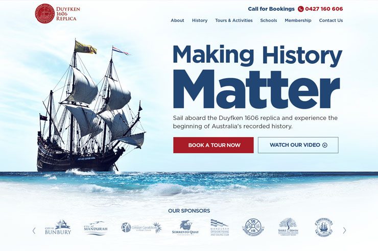
1. Make Use of ‘Above the Fold’
Above the Fold is the section at the very top of your page that can be viewed without any additional scrolling; if you don’t get this section right then the rest of your page won’t matter.
I’ve seen amazingly, well designed websites practically void of visitors that scroll beneath the fold. Why? Because visitors found exactly what they needed the moment they landed and they didn’t need to scroll any further to find it.
But time and time again I see this critical space poorly utilised – massive sliders featuring generic stock images and shitty generic headlines like “we love our customers” without any indication of what you do or how you’re going to help to solve my problem.
2. Drive Home the Benefits
You know how your product or service helps your customer, and, if you talk to a prospective client about it, you have no problem showing them the benefits. Yet too many businesses don’t highlight those same value-adds on the website. Instead, many sites are all about the company, rather than about the customer.
One way you can tell if this applies to your current setup is checking out your current web copy. Is it more filled with the word “our” than “you?” If so, rewrite your web copy, as if you’re having a conversation with your customer and explaining the benefits.
Want to flesh this out quickly? I tell my clients that I’m going to use their competitors and guess what happens the moment I do? They start telling me all of the reasons why I should use them and why their competitors are hacks – that’s exactly the kind of content you need on your site.
3. Use Testimonials
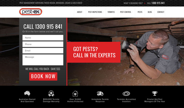
According to Inc., 84% of people take as much stock in online reviews as word of mouth from friends and family. You can use this to your advantage, by asking your happy customers for testimonials and showcasing them on your website, Google My Business and other popular review sites.
Remember, the best testimonials go beyond, “Joe is the greatest!” Rather, testimonials that catch attention are those that show specifics. “Our website was practically dead, but Joe’s web marketing company pinpointed the problems and made the necessary changes. Now, we’re making more sales than ever!” It’s clear what Joe delivers from this level of detail.
You can even make it easy for customers to craft reviews by writing a sample testimonial for them. (This is especially easy if it’s something they told you in a conversation. You can capture the essence of what he or she said, show it to them for approval, and voila – you have a great new testimonial!).
4. Use a Strong Headline
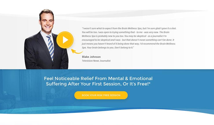
It’s said that ad legend David Ogilvy AKA ‘The Father of Advertising” explained, “on average, five times as many people read the headline as read the body copy.” In other words, your headline needs to have a strong promise and be clear, concisely expressing who it’s meant to help. Bonus if you can incorporate a time reference or guarantee, such as, “in 30 days or less.”
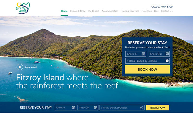
5. Use a Call-to-Action
If you want your visitors to do something, tell them! Want them to download your handy-dandy guide, “15 Non-Toxic Ways to Prevent Fleas and Ticks on Your Dog or Cat,” without batting an eyelid? Then say something like: “Discover how you can prevent fleas and ticks without poison! Download your free checklist here.”
Don’t fall into the trap of thinking your visitors can read your mind, tell them what you want them to do and constantly reinforce that across the site.
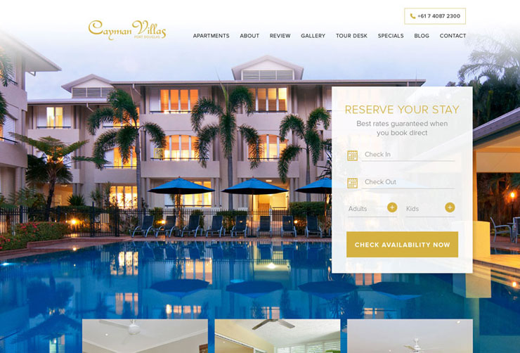
6. Meet Expectations
If your visitors are coming to a specific page from a PPC campaign, then mirror the promise in the ad on the landing page.
Here’s an example we see too often – ads that don’t match the promise. If you run ads that promise an all-natural flea control checklist, but you direct the ad link back to your homepage, you’re going to have poor conversions.
Someone who clicks that link expects a flea control checklist, so send him or her to a form where they can share their email address and receive the checklist.
Make it simple for your visitor to get what they want.
7. Remove Distractions
If you want visitors to watch a video, then send them to a page specifically designed to allow them to watch that video. Remove navigation, social media buttons, or anything else that can divert their attention.
The marketing automation company Hubspot found that landing pages without links performed up to 28% better. Why wouldn’t you give yourself the best chance you could to keep a warm lead’s attention?
What’s important is you remove any distractions that are unnecessary – too many businesses put their social links at the very top which only distracts me to watch “funny cat videos” than make me engage with your business.

8. Keep Fields Minimal
If you’re asking visitors to fill in a form to receive something, you’ll have more success with fewer required fields. Do you really need to know their city, postcode, and telephone number? If you don’t, leave them out.
I know what I’m like, if contacting someone is too hard then I’ll put it off – “Meh, I’ll do this later”… But guess what? Often I never come back.
9. Consider Your Images
Do your images reflect your brand or are you using the same stock photo that your competitors are using? Get specific with the story the pictures and photos on your site tell about your brand.
I’ve seen conversion rates double overnight simply by changing stock images to actual team images – they don’t even need to be from a professional photographer. Just get a friend to come in with the latest iPhone and you’ll be able to get photos that will do far more for your conversion rates than stock.
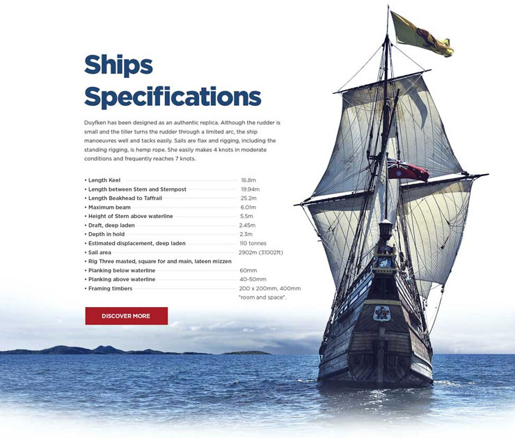
10. Make it Obvious
Okay, so maybe buttons matter – just a bit – but it’s not necessarily about the font choice. If your button size is tiny, or if you’re using a link instead of a button, that can affect conversions. Make sure your click-to-buy or sign-up button is a button – not a link – and that it’s in an obvious place.
We also recommend having one consistent branded (hopefully bright) colour that helps ‘pop’ all of your critical call-to-actions. Make sure your critical buttons stand out against the supporting content.

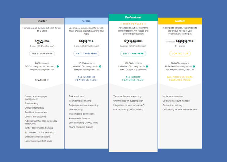
11. Offer a Clear Choice
If you must have more than one choice, such as three options for a software subscription, then show one as the “most popular” choice. People are inherently lazy, they like having the work done for them and they also like feeling like they are on-point with trends and aren’t going to be left behind or locked in as they progress.
12. Add Payment Verification Symbols
From SSL encryption to the PayPal verified badge, customers feel more secure when they see familiar symbols. On a psychological level, these icons reassure customers that their information is safe.
Remember, every highly-converting website has a professional who looks at each page individually and optimizes it for conversions. That optimization includes keeping the language clear and customer focused, as well as guiding your visitor to the path of taking the next step.
How Do You Implement These Conversion Boosters?
Now that you’ve reviewed these conversion boosters, apply them to your core pages.
Which are your core pages? If you’re running PPC campaigns, start with the pages your ads link to – AKA your landing pages (where your visitors land, after clicking on the ad) – and review them with a critical eye.
Worried about your SEO? Look at your landing pages in Google Analytics, AKA the doorway pages into your site, and review those too.
Ask yourself these questions:
- Is it clear who the product/service helps?
- Does it match the language, benefits, and offer presented in the ad?
- Is the language customer- and benefit-driven? (For example, “this time-saving widget will save you 12 hours a week on average,” instead of “our widgets save time.”).
- Do you have a solid headline that speaks to the problem of your target customer?
- Do you have one offer or multiple? If multiple, does one stand out?
- Is it a stripped-down page (i.e., no navigation, social media, or other distractions)?
- Do your images match your brand? Smiling people are good images to include as they promote feelings of happiness.
- If you’re asking for information, are there minimal required fields?
- Is your buy button prominent?
- Do you have trusted payment symbols, like the PayPal-verified badge?
If the answer is “no” to any of the above recaps, tweak your pages until they meet these objectives. Make a list and check things off. In some cases, it may only take minor revisions to boost your conversions.
Want The Best In High Converting Websites?
By now, you understand some of the key elements in crafting high converting web campaigns. You probably also recognize that it takes a practiced marketing eye to recognise all that goes into it. For some, implementing these strategies independently is a fruitful exercise, but for others, a helping hand may make the task more approachable.
Let’s face it, I can teach you all I know about how to speak Japanese but that doesn’t mean you can speak it.
If it makes more sense for you to turn to the pros, our team would be happy to offer a hassle-free chat, to discuss how our dedicated design team can help boost your online conversions. We work with you to flesh out all of your specific benefits and call-to-actions while wrapping it all up into a killer design that will leave your competitors in the dirt while massively impacting your revenue.
Contact us now to learn more about how we can help you boost your online sales or view our design portfolio here.


